
1 The History of Symbols
2 How Handwriting Developed
3 Typographic Milestones
4 A Short History of Books
5 Arts & Crafts and the Private Press
6 History of Posters
7 Avant Garde Typography
8 The Birth of Modernism
9 The Bauhaus
10 The Origins of Advertising
11 The Digital Revolution in Design
12 Design After Modernism
13 Design for Social Good
14 Site Bibliography & Sources
| The Private Press Spreads Through England and Elsewhere | |||
 Click for larger image |
 click for larger image |
 |
Poster by Phil Abel and Nick Gill of Hand & Eye Letterpress |
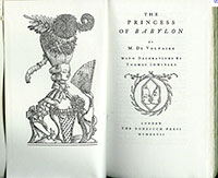
| The Vale Press, 1900
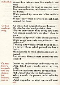
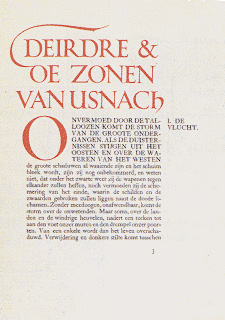
After Morris died, fine press printers looked beyond the medieval era, seeking the clarity of the Venetian Renaissance printers. They designed sparser text pages dependent upon good typography and well designed type faces—encouraging a new generation of type design. Historical type faces were studied, revived and used as the basis for new iterations. New punches were cut, new types were cast. Some designers, working between the worlds of the private press and the commercial press, were able to bring the better quality to the mass market. Important typographic figures who emerged from the private press include Eric Gill, Bruce Rogers and Frederick Goudy. Morris inspired numerous fine presses in England starting with Charles Ricketts' Vale Press, followed by Essex House Press, the Doves Press, Lucien and Esther Pissarro's Eragny Press. The movement spread internationally through Europe and the United States. Charles Ricketts (1863-1931) book designer, wood engraver, illustrator and printer started the Vale press to publish work by both classical and contemporary authors. Initially he emulated Morris's border engravings and elaborate initial capitals but later scaled back the decoration. The press closed after producing its masterpiece, the Vale Shakespeare. (Shown above) Three type designs were produced for the press; Vale, based upon Jenson, Avon and the King's Fount. Ricketts destroyed the matrices and type of all three by tossing them into the Thames or melting back into metal. Read Rickett's Defense of the Revival of Printing, 1899. |
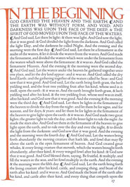
Doves Press, 1900
Encouraged by Morris and wife Jane, T. J. Coben-Sanderson (1840–1922) quit an unhappy law career to become a book binder. His successful bindery engaged a number of craftsmen who produced over 1,000 of Coben-Sanderson designs. In 1900 he founded a press in partnership with Emery Walker (who had previously worked with Morris.) The books of the Dove's press were the polar opposite of Morris—the Kelmscott's ornate style was rejected for clean, elegant pages that emphasized fine typography. In the five volume Dove's Bible, 1903, set metal typography was harmonized with large calligraphic initial letters drawn by Edward Johnston. Read more about Johnston on this site here or on the Edward Johnston Foundation site. The press's typeface was based upon the design of Nicholas Jenson, cut by punchcutter, Edward Prince and cast at Miller & Richard type foundry. Under Coben-Sanderson's direction the result was considerably lighter than the Kelmscott Jenson. Sadly, the punches and matrices were lost forever when the volatile Coben-Sanderson chucked them into the Thames River after a disagreement with Walker. Today you can see a similar digital revival by Torbjörn Olsson. Edward Prince (1846–1923) |
Golden Cockerel Press, 1920
Taken over in 1924 by Robert Gibbings, The Golden Cockerel Press distinguished itself not only for its high quality of printing but for the rich wood cuts by various artists including Eric Gill. The masterpiece of the press is the Four Gospels, which used Gill's wood cut illustrations as well as his type face design. Nonesuch Press, 1922 |
Eric Gill (1882–1940)
Eric Gill had talents in many areas: letter carving, wood block engraving, calligraphy, printing, type design and sculpture. Embracing the arts and crafts communal life style and the rejection of industrialization, he added his own mixture of eccentric clothing, sexual obsessions, devout Catholicism and familial devotion. A quote by Abbot Ford in Gill's diary seems to sum up Gill's philosophy, "Ideals are more important than morals." Gill launched his type career after studying under Edward Johnston who significantly influenced both Gill's style and professional dogma. Despite his dislike for mechanical typesetting in 1923 Gill was persuaded to create commercial type for Stanley Morison, type adviser to the Monotype Corporation. Under Morison's direction Gill designed a number of successful typefaces. The book font, Perpetua (1929), used the Trajan Column inscription as the model for the upper case. Gill did not cut punches, declaring “it is not my country” hence Parisian typesetter Charles Malin executed the masters for monotype production. His famous Gill Sans, quite similar to Johnston's Underground design, was developed to compete with sans serifs, such as Kabel and Futura, that were coming out of Germany. With an intense aversion to photo mechanical scaling, Gill preferred to draw each size and weight individually to avoid distortion. Joanna, designed for Gill's private press, Hague and Gill, was modeled after the work of Robert Granjon. It was used for setting Gill's An Essay on Typography, 1931, which can be partially read on-line on google books. Included in his manual are some of his thoughts about the evils of industrialization and history of letterforms until 1930. |
| Private Presses Outside of England | |||
 |
 |
 |
 |
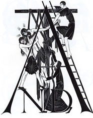
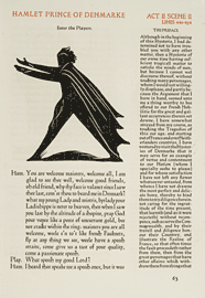
| The Cranach Press Weimar, Germany, 1913 Count Harry Kessler, (1868–1937) although not an artist himself, established his Cranach Press by assembling a stable of the best talent money could buy including Eric Gill and William Morris's former punchcutter, Edward Prince. (Although Prince had some problems link). The Cranach Press produced three masterpieces including the "Eclogues of Virgil," 1926, illustrated by Aristide Maillol and Hamlet, 1930, featuring wood-engravings by Edward Gordon Craig. (Shown above)
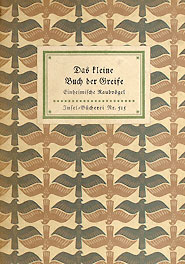
16. Insel Verlag (1899)
|
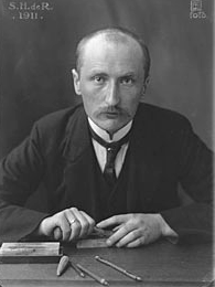
Sjoerd Hendrik de Roos (1877–1962) The Netherlands
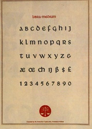
Both van Krimpen and de Roos remained committed to traditional book typography while their contemporaries experimented in avant garde directions. (see see Avant -garde lecture for DeStijl). De Roos, dedicated to the revival of Dutch book design, completed the first Dutch typeface in 150 years, Hollandsche Mediæval, in 1912. Influenced by the Art and Crafts movement, he was a pioneer in bridging the gap between the Arts and Crafts movement and the reality of modern book production. De Roos was employed at the Amsterdam Type Foundry as both graphic designer and type face designer. He produced numerous typefaces for both commercial and private press. His produced an uncial face, Libra, for J. F. van Royen's Zilverdistal Press.
|
Jan van Krimpen (1892–1958) The Netherlands Van Krimpen started his career as a bookbinder but taught himself calligraphy using Anna Simons' German translation of Edward Johnston's Writing & Illuminating, & Lettering. (See more about Anna in the Writing Lecture, #20) In 1925, he began working as a professional type designer at Joh. Enschedé and Sons in Haarlem. His early type design, Lutetia, used as the official Dutch font at the Exposition International des Artes Decoratifs et Industriels Modernes in Paris in 1927, was critically praised. At Enschedé he worked with P.H. Rädisch, one of the last punchcutters in the Netherlands. Van Krimpen's designs included Romanée, Romulus, Haarlemmer, and Spectrum. Romulus was a early 'super family' with roman, cursive, chancery italic, sans serif and Greek in a range of weights. You can read his thoughts on type in his On Designing and Devising Types. (Recommended Reading and van Krimpen content source: Sjaak Hubregtse:The Aesthetic World of Jan van Krimpen.)
|
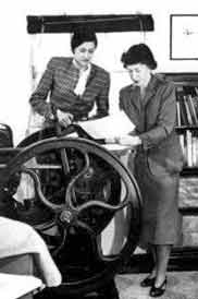
Women and The Private Press A communal synergy, echoing that of the husbands and wives who worked together at the family press during the earliest centuries of printing, was rekindled during the arts and crafts period. Some women entered as writers—such as English author, Virginia Wolf, who started the Hogarth Press with her husband in 1917. Victor Hammer (1882–1967) Austrian born Hammer established his press, the Stamperia del Santuccio, in Italy in 1929. He brought his knowledge of 15th century printing to the US as a teacher at Wells College where he designed the typeface American Unical. In 1943, Carolyn Reading, first Hammer's student and then his wife, organized the Bur Press with printer, Amelia Buckley. They printed books thematically centered on Kentucky. In 1956, Carolyn Hammer founded the King Library Press, printing on Victor Hammer's reconstructed Florentine wooden hand press. An interview with An interview with Carolyn Hammer.
“I have tried in all ways
|
| Copyrights | |||
| ©Designhistory.org 2011 | For Permission Info click here | ||
