
1 The History of Symbols
2 How Handwriting Developed
3 Typographic Milestones
4 A Short History of Books
5 Arts & Crafts and the Private Press
6 History of Posters
7 Avant Garde Typography
8 The Birth of Modernism
9 The Bauhaus
10 The Origins of Advertising
11 The Digital Revolution in Design
12 Design After Modernism
13 Design for Social Good
14 Site Bibliography & Sources
| Symbols on Screens | |||
 |
 |
 |
|
| William Golden (USA,1911-1959) In 1951, the creative director of CBS TV's Advertising and Sales Promotion department, William Golden, created the first symbol that was deliberately considered for how it would appear on screen. There are several different stories explaining why Golden chose the eye. 1. According to the CBS web site Golden's original inspiration came while driving through Pennsylvania Dutch country. He became intrigued by hex symbols resembling human eyes that were painted on the Amish barns to ward off evil spirits. Additional inspiration was found in Shaker art from 1850s. His basic concept was to portray television's unblinking electronic eye. With the help of graphic artist Kurt Weihs (Weiss)(d. 2004) the first CBS eye logo was drawn. 1 Link to more information. 2. We have read a Weihs quote in which he claims the eye image came from an article about Shaker design in Alexey Brodovitch's Portfolio magazine. 6 ) 3. Steven Heller tweaks this corporate history in his article discussing new source material. 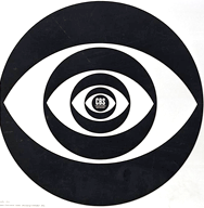 An early version was planned as an animated logo. |
Paul Rand ABC logo
Early television was in black and white and the resolution could be quite murky. Rand experimented with drawing letterforms that would remain readable under the worst case scenario.  Rand's logo was introduced in 1962, the same year as the Jetsons first appeared on ABC.  © Hanna Barbara Studios |
The First Animated Logo Originally NBC's logo was a black and white animation showing bars of a glockenspiel. It was replaced in 1956 by the work of New York designer Fred Knapp who created the peacock in conjunction with John J. Graham of the NBC Art Department. The following year Elektra Film Labs of New York City created an animation that started with static bird that fanned out into a color spectrum. 2  In 1985 "the peacock was hatched anew, stylish and strikingly simple, with the initials NBC added to it in a specially created lettering style" by the New York branding powerhouse Chermayeff & Geismar. (Also designers of the PBS logo) An entire history of the NBC logo. |
Saul Bass The work of Saul Bass (1920-1996) revolved around entertainment screens, both television and movies. Originally a New Yorker, he left the city in 1946 for California. By 1952 he'd established his own office specializing in movie posters, film trailers, advertising and logo design. His ground-breaking 1955 trailer for Otto Preminger’s The Man with a Golden Arm (trailer online) lead to numerous other title designs which he created in partnership with his wife, Elaine Bass. 2 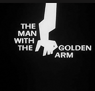 Bass won an Oscar for his own film, Why Man Creates. We suggest you watch this segment, A Parable, about a ping pong ball that bounces too high. His 1972 logo for Warner Communications (top) was one of many logos he designed, including Bell Telephone, AT&T, Continental Airlines, Quaker Oats and the Girl Scouts of America. See a collection here. |
| The Branded Screen User Interface Symbols | |||
 |
 |
  |
|
| Apple Apple cofounder Steve Jobs's only direction to designer Rob Jannof was "don't make it cute." Jannof designed two versions, one with and one without the bite—suggesting the bite for scale so the apple would not be confused with a cherry. Only later did he learn the computer term "byte." The original logo was released in 1977 with color stripes to to broadcast that Macs had color screens, the first for personal computers. Landor & Associates made updates in the 1980's 3 |
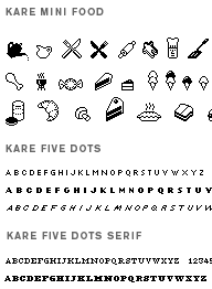
Susan Kare, Mac Icons
“The visual language of point-and-click computing came to life from the imagination of Susan Kare, a fine arts curator hired by Apple in 1983 to design the look and feel of the Macintosh interface. Her whimsical, easy-to-grok icons tempted even nontechies to pick up a mouse, and her sleek screen fonts—with jet-set names like Geneva and Monaco—launched the first wave of elegant digital typography.” 4 |
From www.kare.com " Based in California, Kare believes that good icons should be more like road signs than illustrations, easily comprehensible, and ont cluttered with extraneous detail, She also observes that just because millions of colors are available, every one need not be used in every icon and that when icons are meaningful and well- crafted they need not be frequently redesigned. Kareprints. |
The Customizable Logo Starting in 2000 Google began hiring illustrators to create logos for holidays and events. Specialized themes such as Lantern Day in China or Martin Luther King Day in the US were displayed on the site specific to each nation's interest and culture. An archive of Google logo illustrations can be seen here. |
| Footnotes | |||
1 |
4 6 |
||
| |
|||
| ©Designhistory.org 2011 |
|||