
1 The History of Symbols
2 How Handwriting Developed
3 Typographic Milestones
4 A Short History of Books
5 Arts & Crafts and the Private Press
6 History of Posters
7 Avant Garde Typography
8 The Birth of Modernism
9 The Bauhaus
10 The Origins of Advertising
11 The Digital Revolution in Design
12 Design After Modernism
13 Design for Social Good
14 Site Bibliography & Sources
| Type Design in England Continues with Gothic | Importing the Dutch Style in the 1600's | ||
 |
 |
 |
 |
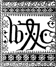
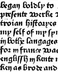
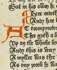
| William Caxton 1420-1492 As both printer and publisher, Caxton made a number of contributions to English literature including the first attempts at the standardization of English. He is credited with printing the first book in English, Recuyell of the Historyes of Troye, 1473, although it occurred in Bruges during his thirty year stay abroad. Caxton returned to London in 1476 with equipment to set up his own press, introducing the process of moveable type to England. His most important works were an edition of Chaucer's Canterbury Tales and Malory's Le Morte d'Arthur (the first novel written in English). Image Right: A detail from Caxton Canterbury Tales which you can see in full edition on the British Library site.
|
Caxton's typographic repertoire was limited to 8 different faces, all gothic forms such as batarde and letter de forme, a textura-like face. Samples of his faces are usually identified not by name but by number, Caxton Type 1, Caxton Type 2 etc. |
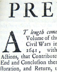
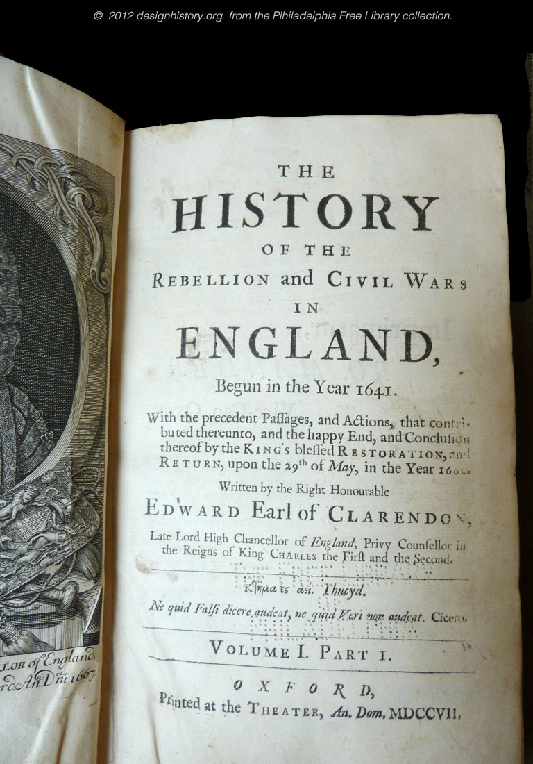
English Type Came From the Low Countries “Printing, as a trade, was thriving in England, but there was not yet an identifiably English style in types. Rather, the types then in fashion were of a class now called "Dutch Old Face," which were used for both mercantile and scholarly printing. The majority of these faces dated, at least stylistically, from as early as the late 16th century, with later cuttings being added during the 17th century” 1 Shown above is a sample of the type cut by Peter de Walpergen (from The History of the Rebellion and Civil Wars in England printed at the Oxford Press in 1701. See it larger here). |
The Fell Types by Peter de Walpergen, in Britain, 1672 Because of governmental restrictions on both printing and domestic typefounding in England most typefaces were imported — primarily from Holland. The Bishop of Oxford, John Fell, assembled the type for the Oxford University Press by importing punchcutter Peter de Walpergen from Holland who cut the Oxford type in the Dutch typographic style. The Fell Types are essentially the link between the Dutch Style and Caslon. You can read the complete history of the Fell Types and download a number of free digital versions of the Walpergen font from Igino Marini. |
| British Type Innovation : Caslon and Baskerville | |||
 |
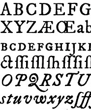
 A snippet from the Cary Collection file of Caslon. |
 |
|
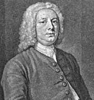
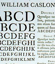
| William Caslon (1692–1776) Caslon was the first to produce English type, although it was much influenced by the Dutch. “Being expert in his craft [engraving], he soon found employment in engraving ornaments and cutting letters...for fire-arms. The letters thus cut by this young man were of such elegant proportions, so conspicuous for the innate taste for beauty of shape ...finished with the truth and loyalty and that perception of fitness that convert the craftsman into an artist that they were shown to Mr. Watts, a printer of eminence of the period. Watts sent for Caslon in 1724 and, showing him several fonts of Elzevir, inquired if he would venture to cut some punches for letters to compete with his. Caslon courageously applied himself to the task and having obtained some small assistance in money to carry on his experiments, accomplished the marked improvement to form which stamped him as the father of English typography.” Caslon started a foundry in 1737 that would remain in the Caslon family for over 120 years—a typographic dynasty. His complete canon included roman, italic, Greek, Hebrew, Arabic etc. Caslon's Great Primer roman and English roman in designs that very closely followed the Fell types and the roman of Miklós (Nicholas) Kis.
|
When in Doubt Use Caslon Carol Twombly revived the face for digital use while working on the Adobe Originals program in 1990. Her painstaking review of his letterforms under a microscope captured the original bite of the metal type. She standardized the forms and expanded the family of weights for text use.
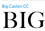
Mathew Carter designed Big Caslon expressly for display purposes of over 36 point. In 1998 Justin Howes letterpress printed samples of each size of Caslon type and then scanned the results, leaving in the individual characteristics of each size and the irregular edges, making no attempt to smooth or regularize the designs. The ITC release, named H.W. Caslon in honor or the foundry name. Read the full account here.. |
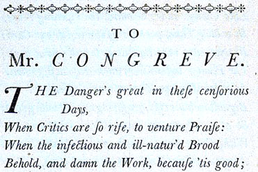
John Baskerville 1706-1775 Baskerville's expertise as a stonecutter and writing master contributed to his type design. Baskerville's letters were cut by John Handy. A perfectionist, Baskerville experimented for seven years on major innovations from press construction, blacker ink formulations and quicker drying printing ink before he produced his first book. Baskerville's work was highly regarded in Europe but not so in England — he inspired the later designs of both Bodoni and Didot. Henry Robert Plome wrote (in his A Short History of English Printing, 1476-1900) "But Baskerville soon became disgusted with the ill-natured criticism to which he was subjected, coupled with the failure of booksellers to support him, and was anxious to have done with the business. The year before the publication of the Bible, he wrote to Horace Walpole a letter given by Reed in which he says that he is sending specimens of his foundry to foreign courts in the hope of finding among them a purchaser for the whole concern, and during the next few years he was in correspondence with Franklin with the same object. Fortunately for his country, these attempts were unsuccessful." See a digital Baskerville Project here.
|
[Benjamin Franklin defended Baskerville's type design, see the section on Franklin below for the whole story.] Despite the example (shown above) from the RIT Cary Collection, Baskerville's typical book designs were devoid of ornaments or tail pieces, in the spirit of the neoclassical era. "Content with the simplicity of typographic art, the English printer has had no need to borrow aid from engraving ...vignettes, tail-pieces ornamental letters..." Baskerville died on January 8th, 1775, and for a few years his widow carried on the foundry; but at the same time attempted to dispose of it. His punches were rejected by English buyers and Mrs. Baskerville was forced to sell them abroad in France in 1779 to the Soci��t�� Litt��raire-typographique of France for ��3700.
|
| Typography in the New World | |||
 A Mexican revival from the 16th C. face by Espinosa, estudio ch. |
Click here for a larger view. |
||
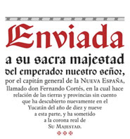
Mexico City, First New World Printers * In 1550, he hired the Spanish typecaster and printer Antonio de Espinosa. Espinosa was the first to design and use Romanic and cursive scripts, which in typography and style are superior to those formerly in use. In the Mexico of the 16th and the beginning of the 17th centuries, Gothic scripts and Tortis dominate printing, just as they had in the motherland of Spain. (Tortis, a script named after the Venetian printer Bautista y Gregorio de Tortis, is plainer and rounder than the Gothic scripts that did not establish themselves in Spain.) 4 Cristóbal Henestrosa (Estudio CH, Tlalpan, Mexico) is the Mexican designer (b. 1979, Mexico City) who co-founded Círculo de Tipógrafos in Mexico Espinosa Nova (2009), shown above, won an award at TDC2 2010 and a grand prize at Tipos Latinos 2010. *Read a more detailed section on how printing got to Mexico in our Field Trip Blog, Guatemala : Printing Pioneers and Modern Volunteers.
|
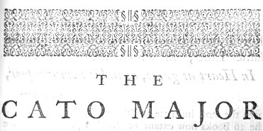
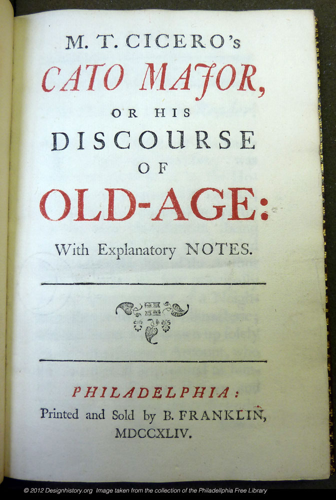
Benjamin Franklin Cato Major, 1744 The first press in the American British colonies was owned by a women in Massachusetts. What all American colonial presses had in in common was a typeface, an imported font of the predominant English face of that era, Caslon. Franklin used Caslon to print many of his publications including Cicero's Cato Major (or Discourses on Old Age), considered to be the finest example of printing in Colonial America. In his "Printer to the Reader," opening remarks Franklin explains that he has printed this piece "in a large and fair Character, that those who begin to think on the Subject of old-age, . . . may not, in Reading by the Pain small Letters give the Eyes, feel the Pleasure of the Mind in the least allayed." To see a larger sample click here. |
“The American revolution ended colonial status and dependence on England, but efforts to make type in America had been of little consequence. Benjamin Franklin's efforts to set up his grandson as a founder were not successful. The equipment he had brought from France passed into the hands of Archibald Binney and James Ronaldson, two Scots who emigrated to Philadelphia in 1796. Not until 1809 did they issue their first type specimen—the first from any North American foundry. The stock and condition of typefaces in America were such that Franklin, while in Europe, complained of nearly going blind as a result of trying to read the Boston papers that were sent to him.” 5 |
That story about Franklin and his defense of Baskerville. " During Baskerville's lifetime his types had little influence in his home country. However, In 1758 Baskerville met Benjamin Franklin who returned to the US with some of Baskerville's type, popularizing it through its adoption as one of the standard typefaces employed in federal government publishing. Franklin was a huge fan of Baskerville's work, and in a letter to Baskerville (1760) he enthusiastically defends Baskerville's types, recounting a discussion he had with an English gentleman who claimed that Baskerville's “ultra-thin” serifs and narrow strokes would blind its readers. Franklin mischievously tore off the top of a Caslon specimen (to remove any mention of Caslon, of course), and showed it to the gentleman, claiming that it was the work of Baskerville. The gentleman examined the specimen, and thinking that it was indeed a Baskerville specimen, started to point out the worst features of 'Baskerville"s' type." 6 |
| Footnotes | |||
| 1 Excerpt from Emigre Essay 2 |
3 4 |
5 6 |
Also A Short History of Printing by Henry R. Plomer, Project Gutenberg ebook.Produced by Barbara Tozier, Bill Tozier, Taavi Kalju and the Online Distributed Proofreading Team, Link |
| Copyrights | |||
| ©Designhistory.org 2011 | For Permission Info click here | ||