1 The History of Symbols
2 How Handwriting Developed
3 Typographic Milestones
4 A Short History of Books
5 Arts & Crafts and the Private Press
6 History of Posters
7 Avant Garde Typography
8 The Birth of Modernism
9 The Bauhaus
10 The Origins of Advertising
11 The Digital Revolution in Design
12 Design After Modernism
13 Design for Social Good
14 Site Bibliography & Sources
| Manuscripts / Documents and Books Written and Embellished by Hand |
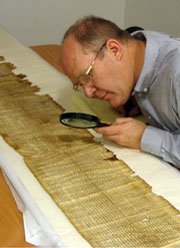 Examining the Dead Sea scrolls 1 |
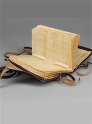 Nag Hammadi facsimile by Irina Gorstein.
 |
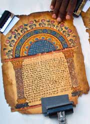 Garima Gospels, the earliest illustrated Christian manuscript. |
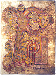 Book of Kells (larger view).
And to
see more pages go here 4
Book of Kells (larger view).
And to
see more pages go here 4 |
| Scrolls The Latin for hand, manus, and for writing, scriptum, are the origins of the word manuscript The first manuscript form was a scroll—sheets of paper, cloth or papyrus attached in one continuous piece and rolled for storage. Text was usually written on one side and divided up into readable sections called paginae. Scrolls were called volumes (from the Latin word for roll). The outside was identified by a title slip, the titulus, which described the contents. Rolling and unrolling scrolls was awkward and made it difficult to access specific sections. Eventually scrolls were folded into an accordion format, a natural precursor of the modern book. 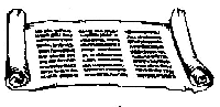
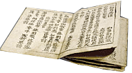 |
Codex Although many civilizations and religions used manuscripts it is the Christian manuscript that was the forerunner of western book design. In the 4th century Christians adopted the codex book form—folding a sheet in half to create 4 pages and then binding numerous folded pages together at a spine. The new format was more portable and easier to manipulate through specific passages. Some historians feel that the codex was used to consciously separate Christian texts from Hebrew scrolls. In 1945 a farmer in Egypt unearthed the Nag Hammad, the oldest known books to date, (estimated date of origin 350-600 AC). The works are a collection of religious and hermetic texts, works of moral maxims, Apocryphal texts and a rewriting of Plato's Republic. The codex, written on papyrus pages can be seen at the link. Note: Palaeography, is the study of ancient writing— the practice of deciphering, reading, and dating historical manuscripts, the cultural context of writing, and the methods with which writing and books were produced, and the history of scriptoria. 2 |
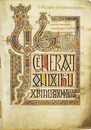
Illustrated Manuscripts Currently housed in Abba Garima Monastery, Ethiopia, are the two volumes of the Garima Gospels, suspected to be oldest illustrated Christian manuscript. (330 to 650 AD). Both of them contain several pages of vivid illustrations typical of early Byzantine style, which include a depiction of the Jewish Temple in Jerusalem, a portrait of Saint Luke, and images of over twenty different birds. 3 Because manuscripts did not have page numbers illustrations were used to divide major sections or within the text lines (interlinear drawings) to aid in locating specific content. Below see interline decoration from the Book of Kells. 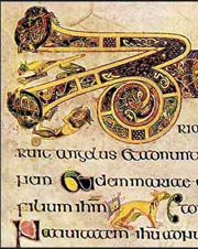 |
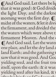
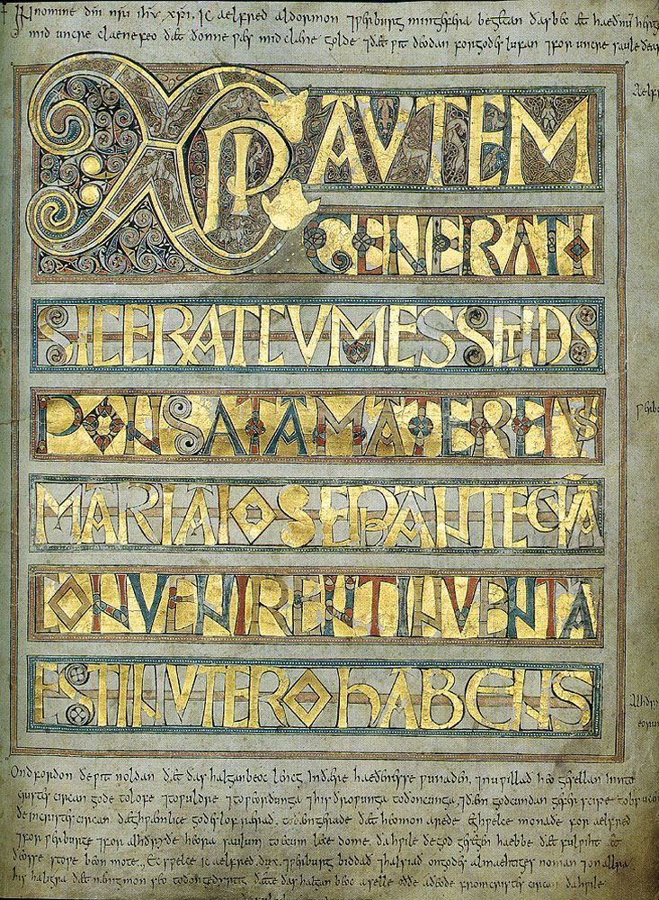
Illuminated Manuscripts One of the most famous surviving illustrated codex books is the The Book of Kells, a masterpiece in the Irish insular style featuring entire pages of intense ornamentation (without text) called carpet pages. The carpet pages were used to separate the books of the four gospels. Often referred to as an illuminated manuscript, the Book of Kells is painted in at least ten colors, however under the strictest definition of illumination gold and silver must be used; they are not found in the book. Several other gospel books did contain gold and silver in their decoration, so much in fact that they were referred to as Codex Aureus or Golden Books. 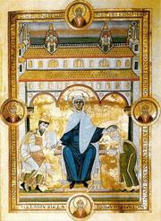 See a larger size here. 5
See another page here |
| Manuscripts : Foundations for Page Proportion, Page Layout and the Evolution of Punctuation | |||
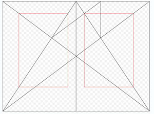 Tschichold's study of the Golden Section (21:34) Page divided into ninths with a page proportion of 2:3. |
 Above, Tschichold's ideal proportions for a medieval manuscript with one block of text. On right it is superimposed over the text of the Gutenberg Bible. |
 |
|
| Creating a manuscript required a serious amount of forethought and planning. The page size was determined and then the areas for text, illustrations and margins were carefully ruled horizontally and vertically. Guides were made by inscribing lines with dry point or drawn with lead or colored ink. The guide lines for text were plainly visible, a feature that was so traditional that the lines were continued into the earliest printed books. Substantial margins were left on all sides, these areas could be used for later notations, corrections and decorations. |
Most commonly the height of the text block was approximately the width of the page, the bottom margin usually the largest and the outer margin about 2/3 of the bottom margin. These generous dimensions would become somewhat smaller at the bindery when the pages were trimmed even.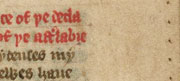 Pricked holes were used to measure the distance for text lines. 6 Pricked holes were used to measure the distance for text lines. 6
|
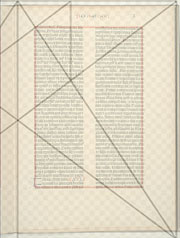
In The Form of the Book, Jan Tschichold wrote, "I finally succeeded in 1953 in reconstructing the Golden Canon of book page construction as it was used during the late Gothic times by the finest of scribes...the height of the type area equals the width of the pages, using a page proportion of 2:3, a condition of this canon, we get one-ninth of the paper width for the inner margin, two-ninths for the outer or foredge margin, one ninth of the paper height for the top and two-ninths for the bottom margin. Type area and paper size are of equal proportions." 7 | Tschichold wrote that studies by Paul Rosarivo proved that the same proportions were used by Gutenberg. Above the golden section superimposed onto a Gutenberg leaf shows some discrepancies which probably result from the pages being trimmed. The text box is the best indicator for comparison. |
 8 |
 9 |
 |
 |
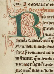
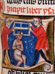
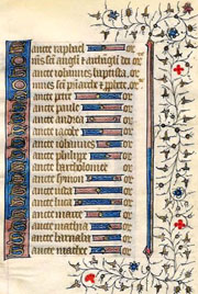
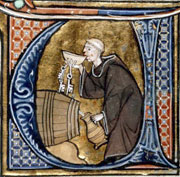
Decorated Initials Areas of the text layout were left blank for the main illustration and decorative letters. Initially all manuscripts were done by men or women from the clergy working in the church scriptorium but as demand for books grew, lay people began to produce manuscripts outside of the church. One manuscript might be worked on by a team of individuals, each with their own specialty and style. Unlike the text writing which followed specific styles, an individual had more freedom to experiment with elaborate pen flourishing.
|
Historiated Caps
Historiated letters are complete narratives painted within a letterform. The practice originated in the insular manuscripts of the British Isles. 10 |
Forerunner of Indention The practice using decorated letters was carried forward into printed books but because it was so time consuming and expensive books were often bound with an empty gap instead. As book printing developed the empty space was eventually reduced to one or two lines, the accepted indication of a new paragraph. |
Pilcrow You may recognize the pilcrow symbol as the invisible symbol indicating the start of a paragraph when you set type on your computer. The symbol is believed to have originated as a letter C, for capitulum ("chapter" in Latin). 11 The pilcrow marked the start of a new paragraph, often occurring within lines of the text. The sample above is from the printed Dove's bible (20th c.)
|
Period Styles, a Punctuated History excerpt from Design, Writing, Research. 12 An essay explaining how punctuation developed— originally to indicate pauses for speakers as they read passages aloud—and later for the reader finding their way through the text. "Although the terms comma, colon and period persist the shape of the marks and their function today are different. During the 7th and 8th centuries new marks appeared in some manuscripts including the semicolon; the inverted semi- colon and a question mark that ran horizontally. A virgule, a thin diagonal slash / that was sometimes used like a comma. The use of punctuation by scribes and their interpretation by readers was by no means consistent, however and marks might be added to a manuscript by another scribe well after it was written. Underlining appeared in some medieval manuscripts and today it is the conventional substitute for italics in handwritten and type written text." |
 |
 |
 |
Justified Type Most text type in manuscripts was laid out in lines justified both left and right. If a line was short, unable to reach the full length, a decorative device or illustration was used to fill in the empty space. 13 Diminuendo |
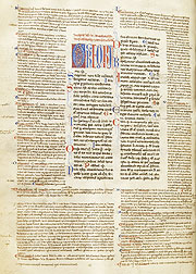
Gloss Gloss is a written commentary accompanying a text, between the lines or arranged as a frame outside of the content. Sometimes the commentary covers more page real estate than the text itself (as seen in the example above). in 1890, James Whistler used gloss commenting to defend himself from critic John Ruskin's critiques in The Gentle Art of Making Enemies. |
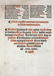
Colophon A notation at the end of a book that includes information about the scribe, the scriptorium, the patron of the work, the date etc. 15 |
|
| Where to Explore Manuscripts on Line | |||
 6 6 |
 |
 |
 Click here to see larger |
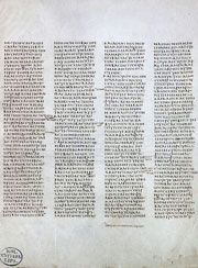
Codex Sinaiticus, 4th C Each line of the 730 large format leaves has twelve to fourteen Greek uncial letters, arranged in four columns (48 lines in column) with carefully chosen line breaks and slightly ragged right edges. The text carries a succession of comments and corrections dating from the 4th through the 12th century.
|
Lindisfarne Gospels, 7th-8th C This text is an excellent example of the Insular Art, a hybrid of Anglo Saxon and Celtic styles. The Lindisfarne monastery was renowned for its elaborate illumination. Most manuscripts were the work of several but this entire work is credited to Eadfrith, a monk who later became a Bishop. The original was covered in a fine leather binding and covered with jewels ( as was the Book of Kells). Those adornments are long gone and now the jewels are the interior illumination. Take a look. |
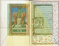
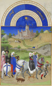
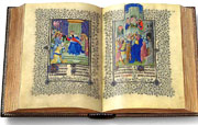
The Trés Riches Heures du Duc de Berry Ms. 65, Musée Condé, Chantilly, France The Very Rich Hours of the Duke of Berry) is a richly decorated book of hours (containing prayers to be said by the lay faithful at each of the canonical hours of the day) commissioned by John, Duke of Berry, around 1410. It is probably the most important illuminated manuscript of the 15th century, "le roi des manuscripts enluminés" ("the king of illuminated manuscripts"). |
The Trés Riches Heures consists of 416 pages, including 131 with large miniatures and many more with border decorations or historiated initials, that are among the high points of International Gothic painting in spite of their small size. There are 300 decorated capital letters. The book was worked on, over a period of nearly a century, in three main campaigns, led by the Limbourg brothers, Barthélemy van Eyck, and Jean Colombe. The Limbourg brothers used very fine brushes and expensive paints to make the paintings. |
Other on-line sources to view |
|||
| Footnotes | |||
1 2 3 Garima Gospels, BBC. 4 5 |
6 7 8 9 |
10 11 12 13 14 15 |
16
|
| Copyrights | |||
| ©Designhistory.org 2011 | For Permission Info click here | ||
